One of my guilty pleasures is spending entirely too much time tinkering with fun little CSS tricks. A site doesn’t feel alive when everything is static. Almost every site can benefit from a gentle hover effect and some carefully implemented motion.
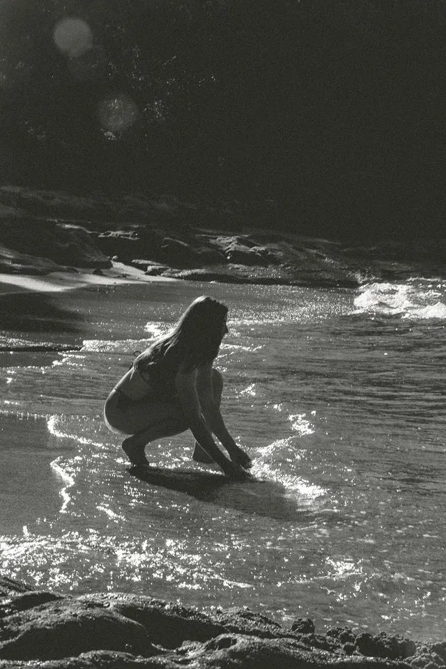
Today I’m sharing a few Lost Coast–inspired CSS experiments, subtle, dreamy little touches that bring a sense of wild beauty and handcrafted charm to your website.
✋🚨 But Wait—What About Accessibility?
You’re totally right to pause and wonder. Animations like these, especially the atmospheric ones, rely on the browser redrawing layers every frame to create smooth motion. That’s no problem on a high-powered desktop but on a mobile device or for users with motion sensitivity, it can cause real issues.
In fact, some animations can trigger nausea, dizziness, or migraines for people with vestibular disorders or neurological conditions. That’s why motion accessibility matters—and why we should always offer fallbacks or reduce effects when requested.
Enter prefers-reduced-motion
Modern CSS lets us respect the user’s system settings with this simple media query:
@media (prefers-reduced-motion: reduce) {
  * {
    animation: none !important;
    transition: none !important;
    scroll-behavior: auto !important;
  }
}This allows users who need a more stable experience to browse your site without animations, even gentle ones.
In real-world projects, I typically pair animated desktop views with static fallbacks for mobile and motion-sensitive users, whether that’s a background image or a soft fade instead of a shimmer.
Now, on to the ✨ Magic
If you’re on a phone—or if you’ve enabled “reduce motion” in your system settings—you may not see these effects in full. That’s intentional. These are desktop-first explorations meant to inspire, not stress your device or your eyes.
Let’s get into it:
1. Animated Coastal Mist
⚠️ Not recommended for motion-sensitive users
The Inspo: My favorite time of year to visit the beach is Autumn. Why? Because it’s when we’re most likely to see those amazing bluebird skies paired with the fast moving mist rolling in off the ocean. Let’s make this happen with code.
The Method: This mist effect is built with pure CSS—just layered radial gradients gently drifting over time. It’s poetic, but also performance-intensive and motion-heavy. For that reason, in a real project I would disable this effect on mobile devices and suppress it for users who prefer reduced motion.
See the Pen Lost Coast Fog V2 by Katie (@fractalkat) on CodePen.
2. Sun Glitter
⚠️ Contains repeated subtle flicker; use with care
The Inspo: Those quiet, enchanted Lost Coast moments when the sun hits the waves just right.
The Method: A mix of CSS and JavaScript animates radial gradients to mimic light glinting off water. Each “sparkle” pulses with subtle timing variations to create a natural rhythm. It’s beautiful—but like the mist, this effect can be disorienting for sensitive users and should always respect prefers-reduced-motion.
See the Pen Sun Glitter by Katie (@fractalkat) on CodePen.
3. Abalone Shine
✅ Subtle, accessibility-conscious animation
The Inspo: The soft, shifting pastels of an abalone shell found along the Pacific shore.
The Method: Using slow background-position shifts and muted gradients, this effect creates a flowing iridescence. It’s gentle, non-flashy, and generally passes accessibility guidelines—but I still gate it behind the prefers-reduced-motion query to be safe.
See the Pen Abalone Shine Button by Katie (@fractalkat) on CodePen.
4. Lost in the Fog Reveal
⚠️ Glowing animation on interaction
The Inspo: Winter fog on the Lost Coast—where everything feels a little hidden, and a little enchanted.
The Method: Subtle glow animations are triggered by user interaction (like hover or scroll arrival). While this is more compliant—because the user initiates it—it still involves visual motion. For production use, I recommend wrapping this in a prefers-reduced-motion check and keeping the animation duration soft and short.
See the Pen Lost in the fog by Katie (@humboldtcreative) on CodePen.
I love making little CSS tricks like these—tiny moving pieces of code that try to capture the magic I see in the world around me. Whether it’s the way sunlight sparkles on water or the softness of coastal fog, I’m constantly inspired by the textures and light here on the Lost Coast.
But accessibility always comes first. These experiments are just that—experiments. In production work, I adapt them to be inclusive, respectful, and performant across devices. That means static fallbacks, reduced-motion support, and a mindset that beautiful doesn’t have to mean animated.
I’ll be continuing this series with more CSS experiments inspired by Humboldt because honestly, everything here is a muse.
Have you tried animating textures or natural elements in your projects? I’d love to hear how they turned out. Remix, adapt, or let these snippets spark your own ideas, and don’t forget to make space for every user along the way!


