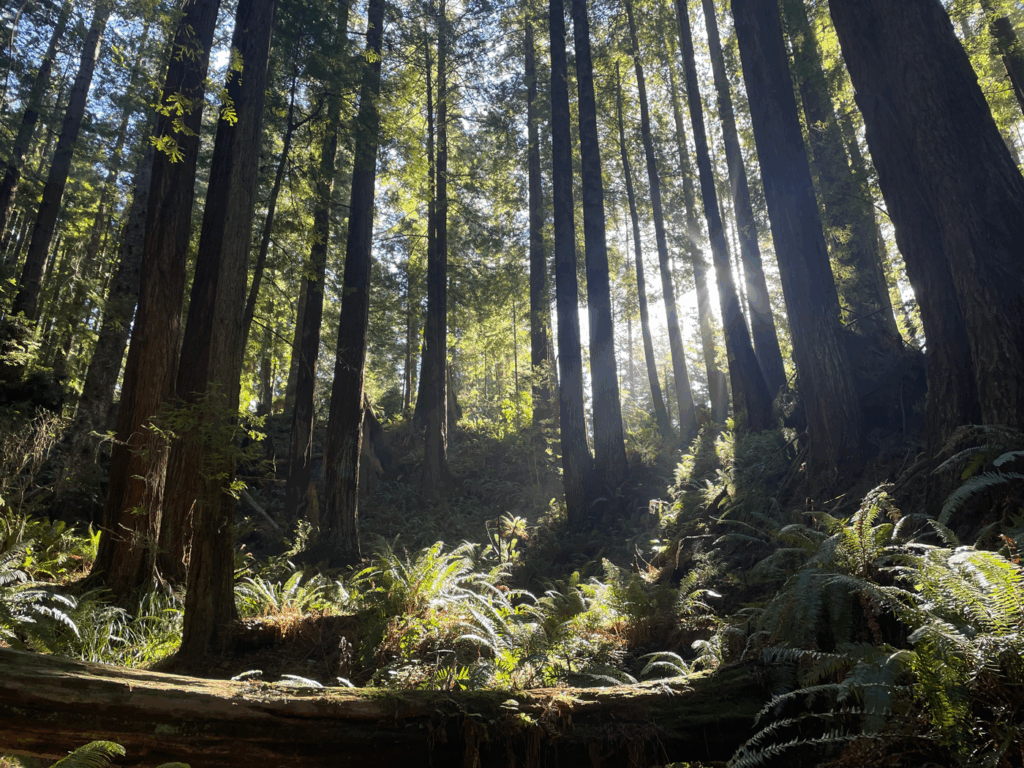
It may not be obvious at first, but the redwoods naturally mirror a lot of the same wisdom used in good UX design. (Or maybe it’s the other way around!) Either way, when you walk through the forest there’s clarity, there’s softness, and a quiet sense of direction. Everything in the forest works together without rushing. It doesn’t need to be loud to be felt, it just works.
And that’s exactly what good user experience should feel like.
All year long I walk through the forest with my kids, spotting beauty and enjoying the trail (even if it’s the same loop we’ve done hundreds of times). Here are a few of the lessons I’ve picked up from the trees, the ferns, and the forest floor, and how they apply to design work.
1. Clear Paths Lead to Discovery
In a redwood grove, the trail is usually obvious. There’s a rhythm to how you move through it. A website should feel the same, intuitive, inviting, and easy to navigate.
What does that look like in the web world? Logical menu structures, clean page layouts, and giving people signposts at just the right moment (just like a trail marker). You shouldn’t have to work hard to figure out where to go next.
2. Stillness Isn’t Empty
One of my favorite things about the woods is how spacious it feels. There’s room to look up, pause, and take it all in. I design websites with that same breathing room in mind, using white space to let your content shine. When everything is competing for attention, nothing stands out. Stillness (or blank space) is what gives your message weight.

3. The Understory Matters (More Than You Think)
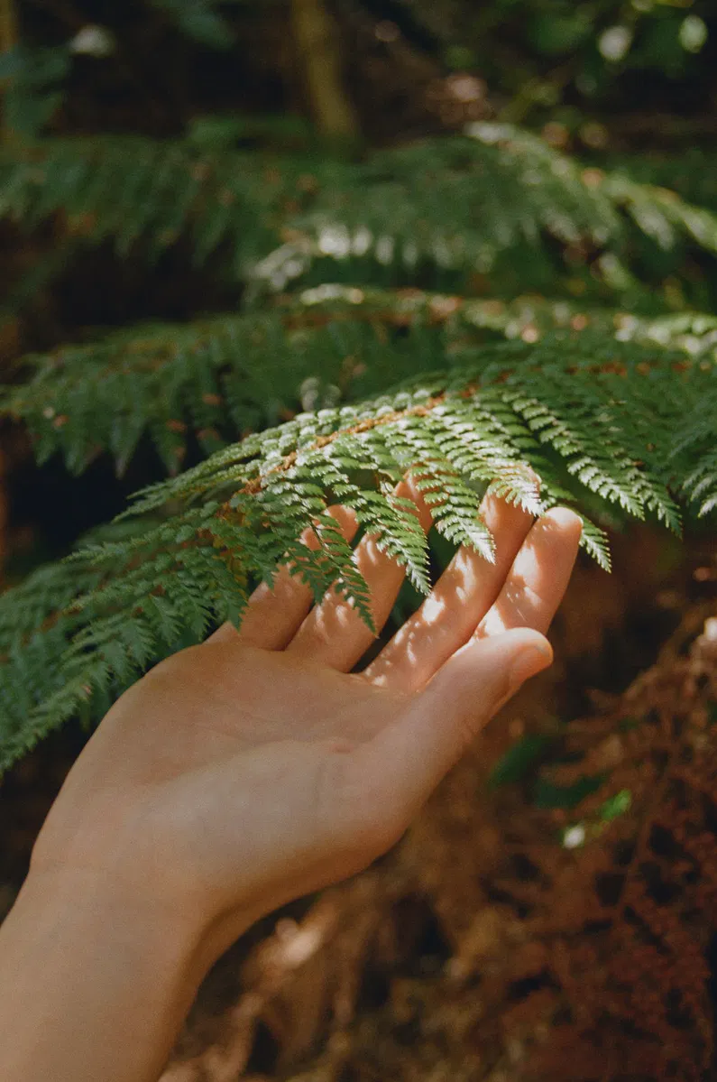
Under the trees there’s a whole quiet world: ferns, lichen, mushrooms, moss. You could miss it if you’re not paying attention, but it’s what makes the forest whole.
In design, this is the part most people overlook. The things you don’t always see right away:
- Subtle button hover effects
- Satisfying transitions (nothing jarring, everything flowing)
- Thoughtful microcopy that helps people feel confident and seen
- Focus styles and keyboard nav for accessibility
These details don’t just look nice, they build trust. They make your site complete and they tell your visitor, “This space was made with care.”
4. Flexibility is Strength
Perhaps my favorite lesson of all. Redwoods sway with the wind. They’re not fragile, but they’re not rigid either and that’s why they’ve survived for centuries.
Good websites are the same. Responsive layouts, flexible content sections, and thoughtful CMS setup mean your site can grow and adapt with you. Whether you’re adding a new product line or rebranding next year, your site won’t snap under pressure.
5. Design for Feeling, Not Just Function
Sure, your website needs to convert. But it should also feel good like stepping into your space, like meeting you for the first time. That’s what keeps people coming back.
So yes, when I build a site we’ll talk calls-to-action and SEO and content structure. But I’ll also ask: How do you want people to feel when they land here? Because that feeling is what they’ll remember.
Final Thoughts
Designing websites and apps is so much more than making a page look nice. When done with care it’s like creating an entire ecosystem, something rooted, alive, and gently guiding people exactly where they need to go.
If that sounds like the kind of magic your project could use, I’d love to work together. Click here to get in touch.


